Fixing Calendar Tile Contrast with OKLCH
Within the first 48 hours of hora Calendar's public beta, a TestFlight tester sent me a screenshot: a banana-yellow event tile in light mode, with the title text rendered in the same banana yellow on top. "I literally can't read this." He was right. I'd been looking at it for weeks and trained myself not to see it. That one screenshot kicked off a two-week rebuild of how every event tile in hora picks its colors — and the result is what shipped on 0.7.0.
This is the technical write-up of how the color system works now: an OKLCH-based palette resolver plus an APCA contrast clamp, applied uniformly across Week / Day / Month and the "+N more" popover. 132 hue × mode × state combinations are now asserted at build time, and all of them pass.
What was wrong
Five concrete failures, all visible in the first beta:
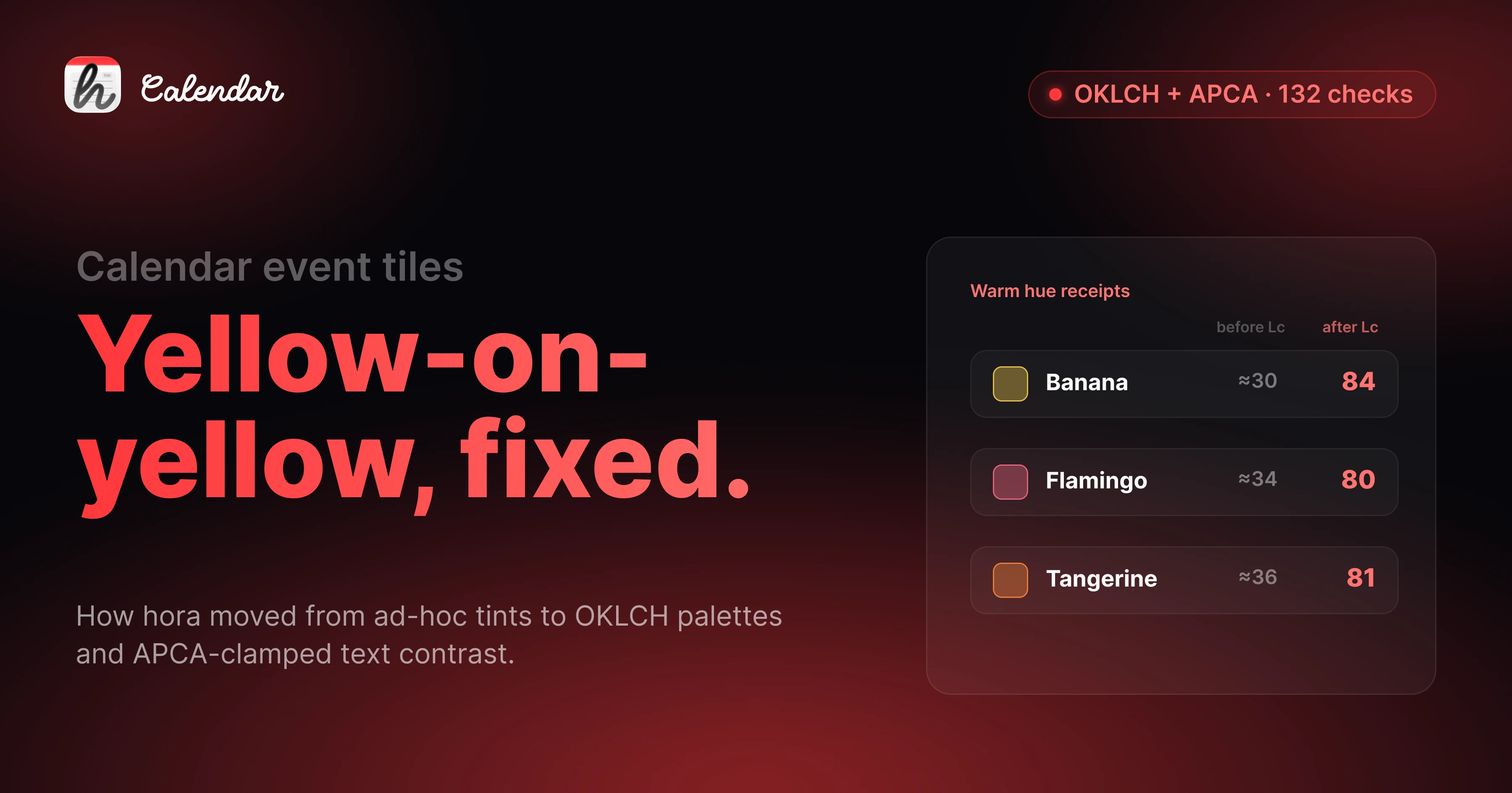
- Light-mode banana, flamingo, and tangerine tiles rendered the title in the brand color on a 25% tint of the same hue. APCA Lc landed around 30 — for context, anything under Lc 60 is unreadable for body text. Yellow-on-yellow.
- Pending invitations showed faded text on a transparent fill with a dashed brand border. The text was there, the eye couldn't find it.
- Tile edges blended into the white grid. No stroke, no definition. In dense weeks, two adjacent events looked like one.
- The shared-event indicator was a stack of 3 pt color stripes down the left edge. Each extra calendar an event lived on added another stripe. It ate horizontal space and stopped scaling past one extra calendar.
- Light/dark opacity values were inverted vs. Apple Calendar —
0.25light /0.15dark, when Apple's heuristic (and the perceptually correct call) is the other way around.
The common thread: I'd treated the color system as "pick a brand hex, multiply opacity, ship it." That works for cool hues. It fails everywhere a warm color sits on a warm-tinted background.
Why WCAG contrast checkers don't catch this
I want to flag this because I keep seeing it in design tooling. WCAG 2.1 contrast ratios do not work for tinted text on tinted backgrounds. WCAG was calibrated for full-saturation text on near-white or near-black canvases. The moment you put a 75% banana text on a 25% banana background, WCAG's L*/Y* math says "contrast ratio 3.8:1 — fine for large text." Your eye says "I'm squinting."
The correct tool for this case is APCA — Advanced Perceptual Contrast Algorithm. APCA was designed by the working group writing WCAG 3 specifically because the ratio model breaks down for tinted-on-tinted text. APCA returns an Lc value (lightness contrast) on a roughly -108 to +106 scale. The thresholds I picked:
Lc ≥ 75for body title (event names)Lc ≥ 60for secondary content (time, location)
These are lower than APCA's "spec" recommendations because event titles are short (3-5 words on average) and the user is scanning a calendar, not reading prose. But they're meaningfully harder to hit than WCAG's 4.5:1 for the same content — and they're the right thresholds.
What I built
The new color pipeline lives in HoraCore/Colors/. Four files, one entry point:
// HoraCore/Colors/EventTileColors.swift
public struct EventTileColors {
    public let bg: Color
    public let fg: Color
    public let fgSecondary: Color
    public let stroke: Color
    public let accent: Color

    public static func resolve(
        brand: Color,
        scheme: ColorScheme,
        state: TileState
    ) -> EventTileColors {
        let oklch = OKLCH(brand)

        // Per-hue lightness clamp — warm and cool land at the same
        // *perceived* L instead of the same *numerical* L.
        let bg = oklch.tinted(scheme: scheme, state: state)

        // APCA contrast clamp — iterate fg lightness in 0.04-L steps
        // until APCA Lc(fg, bg) >= 75 for the title slot.
        let fg = APCA.clampLightness(
            of: brand,
            on: bg,
            until: { lc in lc >= 75 }
        )

        let fgSecondary = APCA.clampLightness(
            of: brand,
            on: bg,
            until: { lc in lc >= 60 }
        )

        return .init(
            bg: bg,
            fg: fg,
            fgSecondary: fgSecondary,
            stroke: oklch.stroke(scheme: scheme, state: state),
            accent: brand
        )
    }
}
Why OKLCH and not HSL. HSL is what most palette code reaches for first because it's everywhere. HSL is also perceptually wrong: yellow at L 50 looks dramatically brighter than blue at L 50, even though both have the same numerical lightness. OKLCH (built on Björn Ottosson's OKLab) fixes this — equal numerical L corresponds to roughly equal perceived L across hues. That's what makes "clamp the title to the same perceived darkness across all 11 hues" possible. In HSL, you can't.
State conventions match Apple Calendar:
| State | Visual |
|---|---|
| Accepted | Filled tint (the default) |
| Tentative | Dashed brand border |
| Pending | Outline-only with solid brand stroke (carries the "needs response" semantic — no faded text) |
| Declined | 40% opacity + strikethrough |
| Selected | Full-saturation brand background + white text, with a per-hue darken pass so the white-on-banana case still hits Lc 60 |
Iconography over color stacking. The shared-event stripe stack is gone. In its place: a 3 pt left bar plus an SF Symbol prefix in the title.
calendar.and.person— events shared across calendarscalendar.badge.lock— events blocked by another calendar (the Family-on-Work pair)
This scales arbitrarily — one icon, one bar, no matter how many calendars an event lives on.
Uniform across surfaces. A TileStateResolver maps Event → TileState once. Every tile-rendering view (WeekEventBlock, AllDayEventPill, MonthView.eventRow) calls EventTileColors.resolve(...) with the same inputs and gets the same output. The "+N more" popover reuses the eventRow view directly, so the icon prefixes propagate without me having to remember to wire them up.
Dedup in MonthView. Previously, an event living on three visible calendars rendered three times in MonthView (it was already deduped in WeekView). Now EventDeduplicator is wired into MonthView too — one render, with the shared-calendar icon, instead of three near-identical rows competing for vertical space.
The numbers that prove it
I added 132 assertions to the HoraCore test suite — every reasonable combination of hue × mode × state, with the relevant APCA threshold:
- 11 hues × 2 modes × → fg-on-bg ≥ Lc 75
- 11 × 2 × 1 → secondary ≥ Lc 60
- 11 × 1 → white-on-clamped-brand (selected state) ≥ Lc 60
- 11 × 2 → pending fg-on-canvas ≥ Lc 60
All 132 pass. Receipts on the warm hues that started this rebuild:
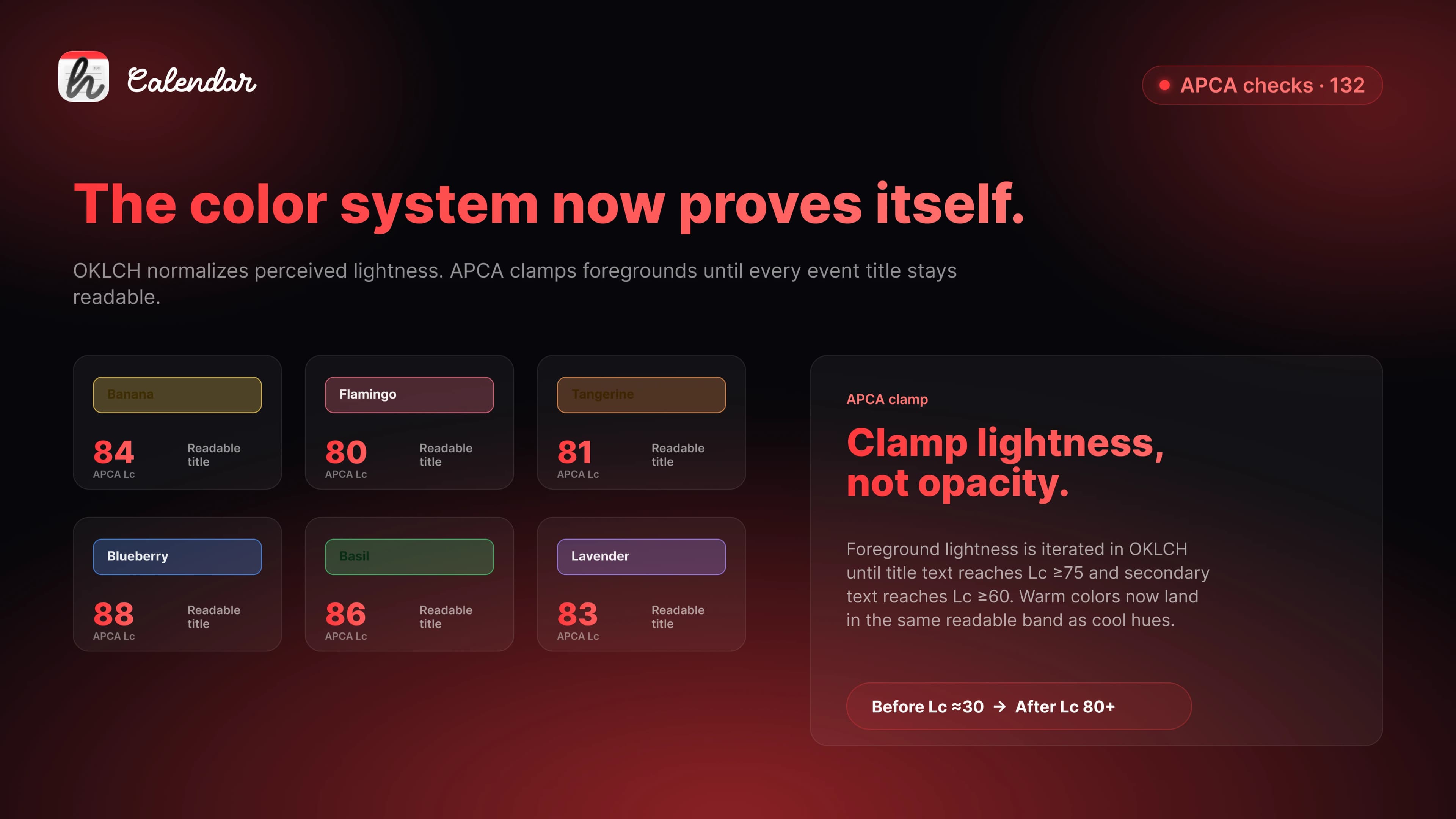
| Hue | Mode | Lc before | Lc after |
|---|---|---|---|
| Banana | Light | ≈30 | 84 |
| Flamingo | Light | ≈34 | 80 |
| Tangerine | Light | ≈36 | 81 |
Why this matters beyond hora
Google's web calendar uses white-on-saturated-brand for tile titles. It passes contrast for cool hues — peacock, blueberry, basil, sage. It fails on the warm ones. That's exactly the "yellow-on-yellow" my tester complained about, and Google has been shipping it for years.
Apple Calendar handles it correctly — they clamp text lightness per hue, which is why a yellow event in Apple Calendar looks readable. But Apple doesn't expose the algorithm. You can't reach for it from a third-party app, you can't write tests against it, and you can't tell what'll change in the next macOS release.
hora now ships the algorithm. It's deterministic, it's testable, and — importantly for the next round of work — it's a clean drop-in layer for Liquid Glass. The OKLCH-derived bg swaps cleanly for .glassEffect().tint(...) while fg and stroke stay unchanged. That means we get Tahoe-era styling without redoing the contrast work.
What's deliberately out of scope
A few things this rebuild doesn't touch, on purpose:
- Liquid Glass adoption — staged separately for the macOS 26 GA cut.
- Widgets, notifications, Pomodoro time strings — they still defer to system locale and don't go through
EventTileColors. Not the right scope to mix in. - All-day pill shared-event detection in MonthView — the all-day strip needs its own dedup hook, tracked as a follow-up.
The temptation when you finally have the right primitives is to apply them everywhere at once. That's how you ship a rewrite that breaks five things to fix one. This shipped the algorithm and the three highest-impact surfaces. The rest follows in 0.7.x.
The takeaway
If you're shipping a calendar, a labels system, a Kanban board, or anything else where users pick a brand color and your UI tints around it — WCAG contrast ratios will let you ship a yellow-on-yellow tile. APCA won't. OKLCH won't.
Two weeks of rewriting a color system because a tester sent me one screenshot was, in the end, the highest-leverage two weeks of the beta. The next 11-hue feature I add lands on top of a system that already proves its own correctness in tests.
Join the beta community
Daily builds. Direct line to me.
Other early testers.
Discord is where feedback turns into fixes. That's where I'll be every day for the next few weeks.
Join the Discord →discord.gg/8JFz4FfBGQ
If you want to see the new color system in action, the hora Calendar public beta is on TestFlight. If you want to switch from Fantastical or BusyCal, the comparison post from Tuesday goes through the why.
Follow the build at @moto_szama, check out hora Calendar, or reach out at hello@horacal.app.
